Apple's Worldwide Developers Conference 2014 revealed many changes in the coming iOS 8. This year, Apple paid much attention to the improvement of message functions, especially the iMessage part. The greatest motivation comes from the rising value of third-party messaging apps, whether in iOS or Android system. Therefore, Apple is expanding its effort to this "most frequently used app in iOS". Here we list some changes and improvements in iMessage, compared with the previous version.

Prior to the comment of the UI of iOS7, I would like to express my understanding of Flat design. Before the release of iOS7, people were all wondering whether the Flat design would be adopted by Apple. What's the meaning of Flat design? Remove the texture, the shadow and gradual effect, making the whole UI look flat, is that Flat design? If that's what Flat design means, then how do you understand Flat Knowledge?
As far as I'm concerned, the real meaning of flat UI refers to the flattening information hierarchy, not just the flat visual effect. In WP system, Flat design modularizes information and compresses the information presentation hierarchy, so some deeply hidden information can be presented in the main interface.
If it simply means the flat visual effect, there's no need for us to discuss it as an independent topic. The graphic design of advertising, the cover design of books, we have already achieved the so-called Flat design long before. The electric product we use at the very beginning, whose display was mosaic, is also in the so-called flat style. Actually, this modernism design which consists of dots, lines and surfaces originated from architectural design and has already been popularized in ad, clothing and industrial domain.
Therefore, flat design is not an indispensable concept, or we can say it's a long-existing idea. There's no need to play up it. The reason why it becomes so hot recently is that the IT design is always lag behind the design theory of other fields.
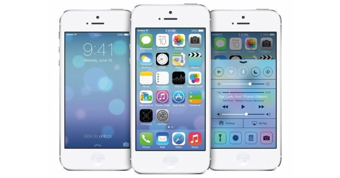
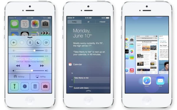
Now let's talk about the UI design of iOS7. We just focus on the visual effect and intuitive feeling, ignoring the details.

From the aspect of graphic structure, the graphics become more flexible in iOS7. In the combination of graphic size with the font-weight, Apple becomes more daring. From pure-colored app to the slender Helvetica Neue UltraLight Italic, deeper contrast, better visual experience. So you may find that the new iOS interface becomes more personalized and vivid.
From the color assortment, Apple is always using bold colors in hardware and ads. This time, it's the interface. To describe this color assortment, we use the word "candy color" from fashion clothing design for reference. I can't say for sure whether it's absolute good-looking or trend, but one thing is certain, this dazzling color matching brings brand-new visual experience to users. Meanwhile, people will easily associate the future and industry sense with future products in science fiction films.
In terms of design language, the UI design of iOS7 combines the "perfect simple" orientation with current fashion, using simple graphical language instead of materialized texture. However, unlike WP system, Apple has kept some attention-grabbing features of materialization design, such as imitation of thunderstorms and the translucent glass effect. It's undeniable that Android has done a lot in weather imitation and glass effect. Android is an open platform, it will do whatever it can do to attract users. But it's tragic for Android being unable to achieve the best whatever it adopts. In plain words, they look not so bad, but you won't love them to death.
The only distinctive feature of dynamic graphic effect is that gyroscope technique endows app naked eyed 3D effect. There's no difference between the interface animated transitions of iOS7 with other OS.
Overall, the UI of iOS7 is a smart and excellent design. After taking the lead of materialization design, iOS has turned into graphic modernization design which will be the leading style in the future. However, it's hard for iOS to distinguish from WP since it adopted the similar graphic language. Also, to differ from the Android style, iOS uses bold candy colors which is hard to imitate since the soft hardware of Apple are tied up. However, the Android and WP's hardware is of varying quality, so it's almost impossible for them to present bold colors perfectly.
Every coin has two sides, the defect of the iOS7 UI has caused many splitslots on the internet. The reason why I admire Apple's design is that the defect of Apple lies in single parts, not in general orientation. For example, some ugly icon does not affect the whole.
Some people complain that the icons are ugly. If you feel it beautiful, then it's beautiful. But if not, I can't make you enjoy it by explaining. If you don't like Apple's design, take another look, maybe that's because you are not classified as the target user by Apple. Apple never caters to everyone.
The last thing I want to say is an expectation. Many third party apps seem out of place after the iOS changed into this style. This is a great challenge for all the iOS developers. Let's wait and see what new designs for iOS7 will come to the fore.